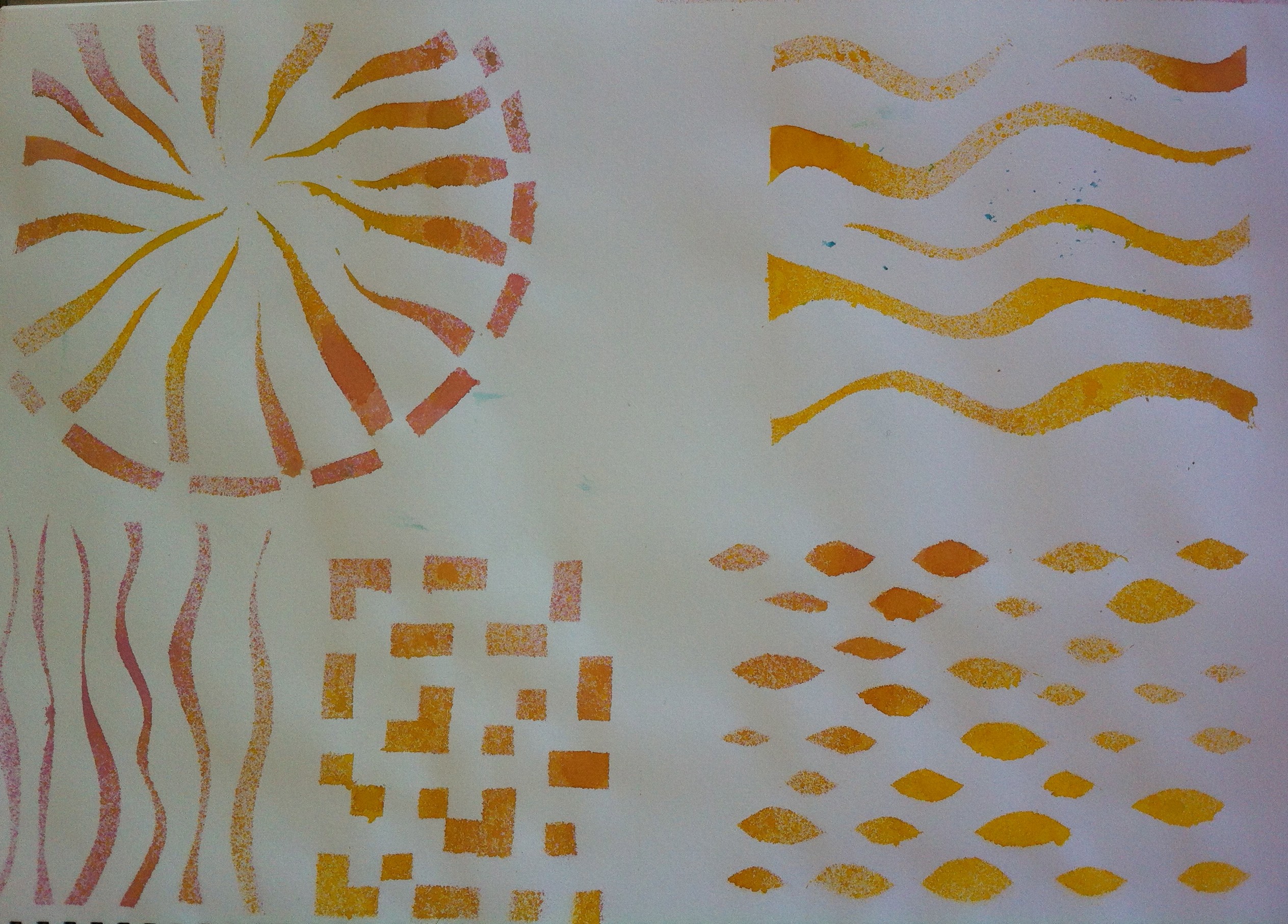
In the last post I wondered how the thickness of plastic placed over wet paint and allowed to dry, would affect the texture. I also wondered how the thickness of the paint would affect the result. Two variables – two experiments.
Step one was to apply gesso to some sketch paper and allow it to dry so I would have a non-porous base layer. After that I applied a background of deep turquoise and magenta acrylic paint. When the background was dry I used some lime acrylic paint thinned with water on one sheet and straight from the tube on the second.
The plastics I used were cling film (Glad Wrap, Saran Wrap) and the plastic that comes wrapped around magazines received through the post (there’s nothing like free resources). I also used re-used some 25 mm or 1 inch bubble-wrap.

1. Diluted top coat, magazine-wrap plastic. The variation in the background looks especially good to me.
Wendy @ Late Start Studio

2. Diluted top coat, cling film.
Wendy @ Late Start Studio

3. Diluted top coat, re-used bubble wrap. I just love the remnants of paint that have been left behind. And again, the transparent top-coat allows the variations of the background to show through
Wendy @ Late Start Studio

4. Full viscosity paint top coat, magazine-wrap plastic.
Wendy @ Late Start Studio

5. Full viscosity top coat, cling film.
Wendy @ Late Start Studio

6. Full viscosity top coat, clean bubble wrap.
Wendy @ Late Start Studio

7. Full viscosity top coat, re-used bubble wrap

8. A close up from the previous sample.
Wendy @ Late Start Studio
I liked the effect of both parts of the experiment, I really liked how the re-used bubble wrap left remnants of paint behind. The diluted paint gave a lovely transparent effect with an opaque paint . . . the first three images have to be my favourites. Whether I use diluted paint or at full strength would depend on what effect I wanted to make.
As to the choice of plastic? The thinner the plastic the finer the details and the more likelihood the results can be controlled to some extent . . . controlling cling film is difficult enough at the best of times however by twisting it slightly, bunching it up after it was laid on the wet paint, I could manage a degree of control over the number of marks but very little over where they were. I thought it would be rather wonderful to be able to manipulate it to form the veins of a leaf.
By removing the plastic just before it was dry it would be possible to soften the edges of the marks but right now I’m thinking about colour combinations; neon over black, black over brights, various earth tones with a transparent top-coat . . . hmmm, this could keep me busy.
Did I have fun? Was it worth while? Will I continue exploring? Will I put samples in a journal? Damn right!